August 11, 2010

banana blueberry baby shower.

i think polka dots are so fun. i don't often choose them for myself, usually opting for a damask or toile print. i should choose them for myself more often, though, because they're so playful. i like this color combination.


while blue is often associated with boys, i think this invitation could work well for a little girl, too, in these very same colors, in pinks, whites ... the possibilities are endless.

August 10, 2010

where's fall when you need it?

i snapped this shot this morning before heading into the ol' office. i can't decide if it means fall, glorious fall, is just around the corner, or if our lovely trees are being cooked to a crisp by the 100+ degree temps we've been enduring for over a week.

as i type this and think of the approaching fall season, i'm reminded of a quote from one of my all-time favorite movies, one that i haven't seen in quite a while.

"don't you love {insert your city here} in the fall? it makes me wanna buy school supplies. i would send you a bouquet of newly sharpened pencils if i knew your name and address."
you've got mail
mmm, i can almost smell the spiced chai lattes and feel the crispness in the air. i can't wait! what are you most looking forward to about fall?

i want this dress!

i have been daydreaming of this dress for the past week or so ... and then i saw it on another sweet girl's blog, which reminded me of the dress again and made me want it even more {for those of you who followed the link yesterday, you probably saw the dress then}.

image courtesy of anthropologie.com

tulsa is getting an anthropologie this month, and i couldn't be more excited! some of their pieces are a little too bohemian-chic for my tastes, but so many of their outfits are classic with a touch of trend. i love it!

August 9, 2010

jones design company. swoon.

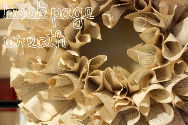
oh my goodness. i stumbled across the cutest blog today {don't you love it when that happens?}. jones design company has beautiful products created from pages of old books. i think my favorite is the book page wreath. i've seen it before but didn't realize that it was by jdc. i also love this book page canvas that she makes:

images from the jones design company blog

aren't those precious? she has several images of these canvases, each with different embellishments and their own little pieces of flair. i am in love.

August 8, 2010

pink limeade on a hot summer day.

I love entertaining, which works out well for me since it goes hand in hand with my passion for paper. A popular color palette {and a favorite of mine in the spring and summer} includes a delicious lime green and shades of pink. I used this color combo for a bridal shower for my sister-in-law, Lindsay.


The event kicked off with the invitation {because what event doesn't ... especially in my world}. I started on the invitation and arrived at the color palette shown above. I'm not an over-the-top, lace-y kind of girl, but I like the eyelet lace pattern along the bottom of this invite.


Isn't it fun for spring and summer? We spruced up the envelopes as well, adding a bit of intrigue before ever getting to the actual invitation.

After the invitation was all taken care of, I contacted the bakery. What's a party without a fabulous cake? My go-to place in Tulsa at the time was Mallory's Mud Pies. As of December 2009, however, MMP no longer exists. {I still don't know the details behind the closing, but was in shock when I heard they had shut their doors}. They were delicious. It just so happened that Justin and Lindsay were also getting their wedding cake and cake balls from there as well so Tracey was more than happy to work on another fun cake for the bride. I always loved working with MMP because they did such a great job of matching cakes to invitations, if you so requested. Here's the cake they created for the bridal shower:

Isn't it perfect? Just posting the pictures makes me hungry ...
We wanted to keep the shower small and intimate. I didn't want to overwhelm our space with added decorations and "stuff" so I relied on our cake and other food to double as focal points. I loved the pedestal decanter with spigot {filled with a pink limeade, of course!} It was beautiful and so easy for everyone to serve themselves without a mess. The floral vases filled with limes were another favorite of mine. So simple, but very pretty.

Aside from the cake, all the food we served was finger-friendly. =)


Tarts . Bagel sandwiches . Croissants and chicken salad . Fresh veggies & fruit .

I don't know how I managed this, but I didn't get any pictures of the setup in the living room where the gifts were opened. We used a lot of tea lights and the now-Leaches' engagement photos displayed in black frames. Again, simple, but oh so pretty. I loved watching the subtle candlelight flicker off their beautiful photos.

The final paper touch was this card with adhesive on the back. Anytime I'm at a shower, the hostess is always frantically writing as each gift is opened, making a list of gifts and the giver. The person writing doesn't get to enjoy the gift-opening and often doesn't even realize all the wonderful things they've written down. This card can be placed right on the gift box, bag, or other packaging so the receiver can quickly identify the giver and write their note cards with ease, while at the same time freeing the hostess to enjoy the party as well. Unlike a greeting card, the adhesive keeps the tag in place on each particular gift.

{Sigh}. Now I'm ready for another celebration!!

What are your favorite color palettes? Any color combos you're just loving right now?

August 7, 2010

get off of the couch and into the action.

all american billiards contacted us needing a postcard for their direct mail campaign. in the past year they've done a complete renovation and wanted customers to see the improvements. we included a few of their favorite pictures along with information about the facility.


if you haven't been in before, it's definitely worth checking out. located in muskogee, oklahoma, this fun venue is a quick drive from most any place in northeast oklahoma and northwest arkansas.

August 5, 2010

p is for perfect.

divine. i love this script-y font. this is definitely one of my favorite note cards. personalize with your own initial, monogram, or even your name.

August 4, 2010

announcing you.

i kept meaning to create this post during the spring, but graduation was a crazy {in a fabulous-kind-of-way}. it's hard for me to believe it's been two months since everyone has graduated.

dr. ryan hurst approached me at the beginning of the year to create an elegant announcement appropriate for his upcoming graduation and hooding from the university of oklahoma college of medicine.

voila. this is what we created ...


i loved the look of this for graduation; and i think it would be great with so many different color combinations for many different events. so many fun seals could be created to help set the stage for the event before the invitation is even opened. i. love. it.
dr. hurst's wifey ordered an invitation for his graduation party that coordinated. {you'll have to scroll down a little once you get to the post}.

August 3, 2010

the brides of oklahoma.

i have been dying for the latest copy of the brides of oklahoma magazine. today i finally got my fix.
i had no idea until i picked up the magazine, but miss america lauren nelson's wedding was featured. for years i watched lauren in the miss oklahoma paegent, so i was so excited to see the spread.
be sure to pick up your copy while you still can.